Data Visualization Design 1 | Context, Data Types, and Basic Charts
Data Visualization Design 1 | Context, Data Types, and Basic Charts

- The Story of Historic Cholera Outbreak
From 1931 to 1954, there was an outbreak of cholera in England and it appears to be 10,000 people died. While people at that time thought that cholera was caused by Miasma in the atmosphere, some kind of breathing vapors.
In 1954, Dr. John Snow started to analyze cholera and he didn’t actually believe in the Miasma in the atmosphere. So he basically tried Data about all people that were dying and he plotted the data into a map of London.

By plotting the data into a map, Snow discovered that the death places of people are actually clustered and most of the cases are considered next to the urban pump. So he basically draws the conclusion that the water from the pump, instead of the Miasma that made people sick.
2. Story of Napoleon’s March on Moscow
The invasion of Napoleon to Russia in 1812 and this particular visualization is showing a lot of interesting stuff in one of the things that he is showing the band so that we can see the kind of rage.
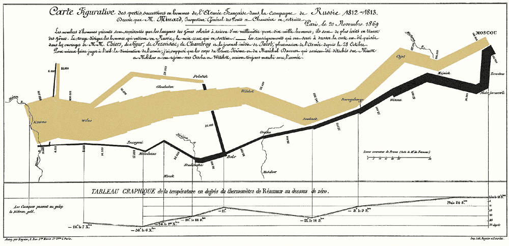
For example, the number of troops in the French army. While at the beginning they started with 420,000 soldiers and by the time they get to Moscow, they have 100,000 soldiers. Then the black line is the way back from Moscow to the Russia-Poland boarder. You can also see where they came across a river and lots of people die when they crossed the river.
3. Functions and Reasons For Us to Create Visualizations
Basically there are three main functions of data visualizations. The three functions are (RAC): (a) Recording: which is to store information; (b) Analyzing: support reasoning about information; (c) Communicating: to convey information to the others. There are also other reasons why we are using visualizations, such as,
- Discover and then Answer questions
- Help to make decisions
- See data in the context
- Expand human memory
- Support graphical calculation
- Find patterns among data
- Present an argument
- Tell a story
- Give inspires
4. The Importance of the Context
(1) Distinguish Between Exploratory Analysis and Explanatory Analysis
Even before making a plot, we have to know what are we going to do. Basically, we are doing data analysis for two kinds of analysis, exploratory analysis and explanatory analysis.
Exploratory analysis is an initial analysis and it focuses on the data and tries to understand and find something interesting in it. While explanatory analysis is a final data, and sometimes something more than the final analysis. It is more or less the information that the data scientist would like to convey or make them consumed by an audience.
The golden rule is that we can do plots as many as we like in the process of exploratory analysis, like 100 plots, but we can never present them to the boss or clients. Maybe they are going to have the plots that are most interesting and important. So this is also to say that exploratory analysis is a kind of information expanding whereas the explanatory analysis is to do some cleaning and to give the most direct insights.
(2) Who, What, and How Questions About Your Audience?
- Who is your audience?
The first thing to go through is to understand who is your audience. This is important because different people may have different requests or ideas and people can be very busy. So again understanding who is the wizard audience and if possible, identify who is the decision-maker in the project and what do they care about. The rule is that all your presentations should be specific and never make a present for multiple kinds of audiences.
- What do you need your audience to know?
Whenever you are asked to give a presentation, there must be something that the audience would like to know from you, or it will just be a waste of time. However, most of the time it appears that the requirements are not clear and maybe the audience themselves are not clear about what they would like to know.
Sometimes the audience just goes on and sends you a request to look into some data or come up with something and the requirements are unclear. It is a good idea to remember that you are the subject matter expert and you should always want your audience to do or to know something (if they are not in demand of the information that you present, make them require it instead of giving the information by force) and never simply present the data.
When it is somehow hard to find out the needs of the audience, make recommendations to actions, and suggest something actionable (or changeable), and they are always good ideas.
- How to present the right data?
We may be struggling at choosing the data that we are going to present and the point is that it is always a bad idea to ignore the data that does not support your point.
(3) Who, What, and How: An Example
Let’s suppose that you are a 4th-grade science teacher and your goal is to continue offering the summer program. The goal of the experimental pilot summer program is to change the students’ perception of science.
Who: The budget committee that can approve funding for the continuation of the summer learning program.
What: The summer learning program was a success; please approve the budget to continue.
How: Illustrate success with data collected through the survey conducted before and after the pilot program.
(4) Consulting for the Context
Here are some questions that we have to figure out if we would like to under the context.
- What background information is relevant?
- Who is the audience or decision-maker and what do we know about them?
- What biases does our audience have with respect to the message?
- What data do we have to support our cause?
- What would a successful outcome look like?
- In a single sentence, what do you want your audience to know?
(5) The Concept of Big Idea
The big idea is a one-sentence summary of your message. It has three main components: (a) it must articulate your point of view, (b) it must convey what is at stake, and (c) it must be a complete sentence.
For example, the big idea in the last case could be: The pilot summer learning program was successful at improving students’ perceptions of science, and because of this success, we recommend continuing to offer it going forward; please approve our budget for this program.
(6) Storyboard Tool
It is always a good idea if we make a storyboard before the actual presentation. Before every plot, we could make a draft or list some ideas on the storyboard and keep in mind that what we would like to finally convey. But don’t start the storyboard with presentation software because we may change them later.
5. Data Types
In order to visualize data, what we have to do is firstly classify the data types and then determine which type of plots represent the data types more effectively.
(1) Three Types of Data
Basically, we have the following category of data types,
- Nominal: the normal data is a bunch of categories that doesn’t have a natural order or rank. i.e. banana, apple, and blueberry
- Ordinal: the resource of ordinal is some data that we have an order. i.e. the size of a T-shirt.
- Quantitive (aka. Numerical): Numerical data is the scaled data that we can actually compare the difference. i.e. ratio (zero is arbitrary) or interval (zero is fixed).
(2) Operations for Different Types of Data
- Nominal Operations: ==, !=
- Ordinal Operations: ==, !=, <, >
- Quantitative Operations: if zero is arbitrary, we have ==, !=, <, >, -; if zero is fixed, we have ==, !=, <, >, -, +, /
6. Basic Charts
(1) Scatterplot
When we have paired numerical data or when you are trying to determine if two variables are related, the scatterplot is a good idea.
(2) Line Charts
We could use line charts in the following situations: (a) paired numerical data, (b) identify a trend or pattern in your data, not to give people exact quantitative, (c) time series, dates, months, a sequence of stages of a project, a sequence of meters along on a gas pipeline, and (d) don’t use line charts with categorical data on the x-axis.
As line charts are not really intended to give people exact numbers, forcing zero scalings is not necessary and can make it considerably more difficult to detect said trends and patterns.
(3) Area Charts
The area charts are mostly used for the time-series relationship. And unlike line charts, they can also visually represent volume. The area between the axis and this line is commonly emphasized with color or shading for legibility. And finally, most often, area charts compare two or more categories.
(4) Bar Charts
When it is for categorical variables (so as time series, it can be both numerical and categorical) versus numerical variables, we can use bar charts. Bars are plotted on a common baseline to allow for easy comparison of values. Space between bars should be 1 ⁄ 2 bar width. And order categories alphabetically, sequentially, or by value.
The category ordering means that we sort the bars from the longest to the shortest unless you have ordinal variables.

(5) Box Plot
The box plot is a plot that shows the min and max value of the distribution, and it also gives the value of the lower quartile, the median, and the upper quartile. The distance (or range) between the lower quartile and the upper quartile is called the interquartile range.
The outliers of a box plot is an observation that is numerically distant from the rest of the data.

The box plot could be used when we use the numerical variable versus the categorical variable. The box plots are a useful way to visual differences among different samples or groups. It provides a lot of statistical information, including medians, ranges, and outliers.
(6) Other Kinds of Plots
We have also other plots and charts that we are not going into their details. They are,
- Multi-Line Chart
- Small Multiple Line Chart
- Histogram
- Stacked Area
- Stacked Bar
- etc.