Data Visualization Design 2 | Choosing Effective Visualizations and Form Follows Function
Data Visualization Design 2 | Choosing Effective Visualizations and Form Follows Function

- Choosing Effective Visual
(1) Plain Text: Basic Visualization for Comparing Two Values
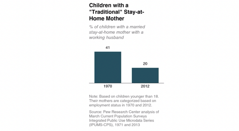
In this case, we are comparing the percentage of children with a married stay at home mother in 1979 and 2012 right and maybe you don’t really need a plot for this. If the main information we just want to show is that 2012 has 20% of the stay-at-home rate, we don’t have to draw a plot actually. For example,

So maybe in some time, the numbers themselves can be the best way to visualize the data.
(2) Table: Not a good idea for a Presentation
Sometimes we use a table to represent data, but this is always not a good idea because people appear to read the table instead of listening to the presentation. However, if there’s a must of using it, use the table with the minimal borders, this is because the data should stand out instead of the orders.

(3) Heatmap: A Better Idea Than Tables
The heat map is a better way to represent data in a form of table because each of the cells is colored and it communicates the relative magnitude of the numbers. What’s more, it helps our eyes to target the points of interest.

However, note that we must use different shades of the same color. If we use different colors for one numerical variable, it can be complicated for understanding and ugly as well.
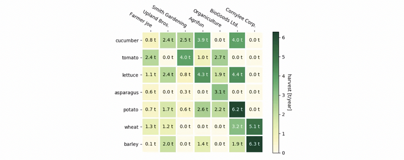
This is an example of the heatmap plotted by matplotlib, it is indeed has a disadvantage that not all the texts in this heatmap are horizontal, but it gives us a perfect instance of what kind of heatmaps we can plot by python.
(4) The Definition of Graphs
Compared with tables, graphs are interaction with our visual system, which is in fact fast at processing information. A well-designed graph will typically get the information across more quickly that a well-designed table. Sometimes it also gives more insights and ideas in the graphs, compared with data in the dull and boring tables.
(5) Scatterplots: the relationship between two variables
The scatterplots are common plots that we can see them frequently, although this is infrequently being used in business (line charts are more often), there are some other use cases, for example, as the academic plots.
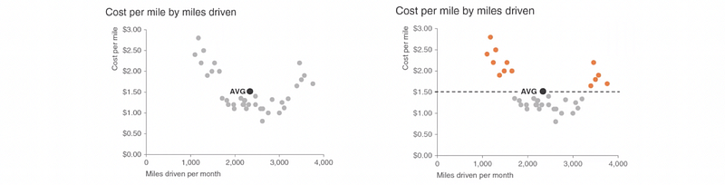
from the graph on the left-hand side, we can clearly see the relationship between these two variables. There is also sometimes we can highlight some of the clusters. For example, in the graph on the right-hand side, the orange dots that are highlighted represented different values costs per mile above the average.
Sometimes we can color different clusters of dots with different colors. Then we can probably find some differences between those two different clusters. The most interesting scatterplots that you may find are perhaps in the journal of Economists and it’s quite fair to say that economists are really good at drawing graphs somehow.
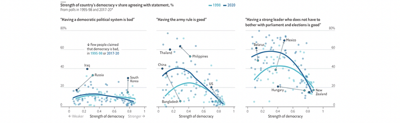
In the plot above, first, there are three titles so that they make different statements. Second, you can also find some outliers, for example, Russia, Iraq, South Korea, etc, and they are highlighted with different shades of colors. This is an example that people are using scatter plots together with line plots.
(6) Line Graphs: the tendency of continuous data
So then another plot that people use a lot is the line graph. And we have talked about that last time and we said it is always useful if the two variables in this plot are all continuous. Probably one of these two variables can be time-series data, which can be treated as both categorical and numerical.
In the following example, we can have A, B, C, and D as different countries and different values perhaps mean the yield of production in each of the months. If we want the other people to see our ideas clearly, we can draw all the lines in grey with one of them being highlighted in the color blue.

Sometimes we plot a line graph of the average values and we also want to plot some kind of confidence interval. (i.e. the maximum value and the minimum value) We can refer to the following plot to draw a new one. And also in the field of machine learning, we also do this quite a lot. It says that I have a particular accuracy on something and we also try to convince that number

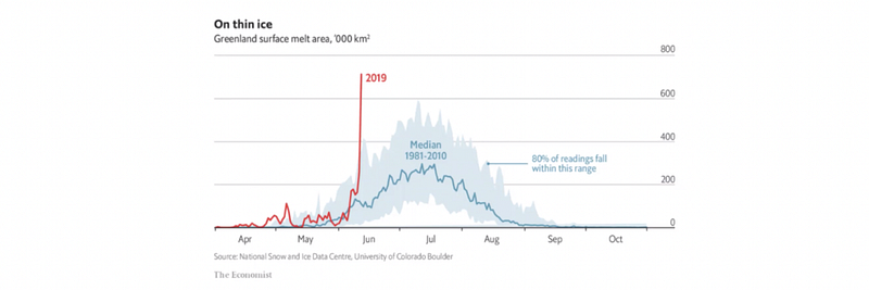
In the following graph, we can see that the year 2019 is high lighted because it is quite abnormal. While in the year 1981–2010, it also implies to us about 80% interval that 80% of the data in these years lies within this range. It is also important to notice that there is information at the bottom of the blog, they stay in grey and they give where these data come from (resource). There is always a catchy title and subtitle in this graph that is actually pretty attractive.
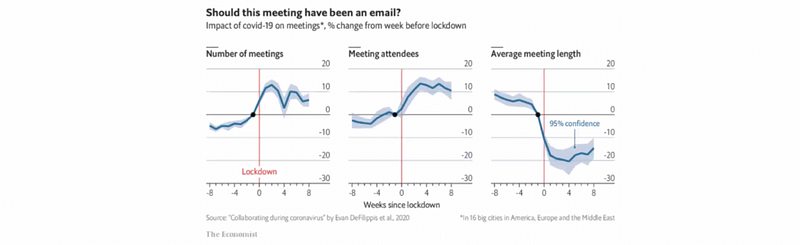
The red line in the following makes the readers understand where is the lockdown and what happened before and after. Also, they assigned the lockdown to zero.
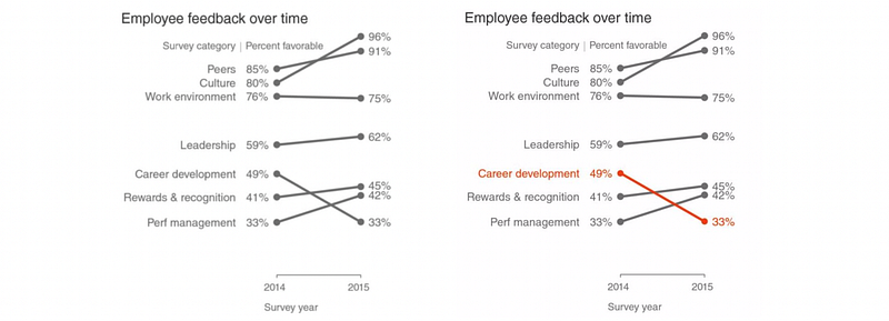
(6) Slopegraph: the tendency of discrete data
A specific case of a line graph is called the slope graph. Two time periods or points of comparison and it quickly shows us the relation between those two variables (increases/decreases) or difference across various categories between the two data points. We can also use color to draw attention to the single category that decreased over time.
(7) Bar Plot
The bar plot is the most commonly used plot in business settings. It has less of a learning curve for your audience which means that it is quite easy for people to understand. It is also easy to see which category is the biggest, and which is the smallest. The most important thing is that the bar plot always has a baseline and it is always being set as the 0 baseline.
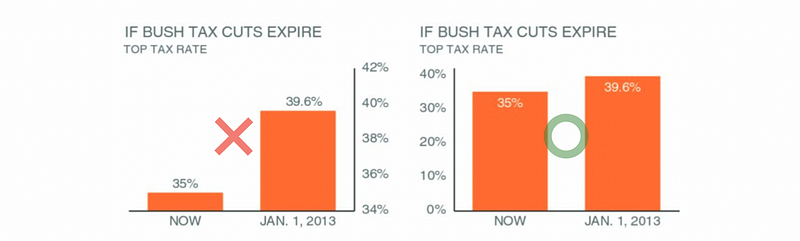
Let’s now see a bad graph from the Fox News, the graph on the LHS has a non-zero baseline and it makes the situation seems worse than what it actually is. Well, then the graph on the RHS has a zero baseline, which in general you can see the difference is not that large.
So when should we use zero as a baseline? This can be quite tricky and we have to follow the following rules. These rules were stated by Alberto Cairo, who is the author of the book How Charts Lie:
(a) If you can include 0 and there’s a natural 0, include 0
(b) If by including 0 your line becomes so flat that you barely see differences, then it’s wrong and misleading
(c) The main purpose of a line chart is to see differences, not to tell how far it is from 0 as a whole (that can be a purpose, too, but a secondary one, and subject to fulfilling the former.)
(d) All these depend on the nature of the data
(e) You really need to consider what it is that you’re visualizing. Again, a difference of 3–4 years in life expectancy is a huge change, even if it’s numerically small
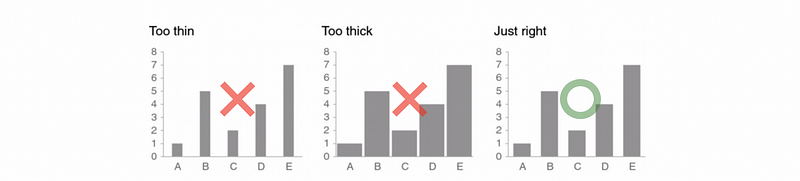
It can be important to keep that in mind is that the space between the bars should be equal to 1/2 of the bar width usually a preferred width.
(8) Stacked bars
Stacked bars are always not a good idea to represent data, it can be misleading and hard to read the information.
First of all, it can be difficult for people to compare different bars. What we can compare is either the lowest partial bar of each bar or the total bar. What we may find it hard to compare is the bar showed in the middle of each bar. For example,
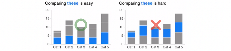
So whenever you have a must to use the stacked bars, make sure the value you want to compare is either listed at the bottom or you are trying to compare the whole value of the bar.
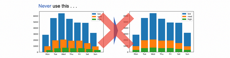
Another thing to keep in mind is that don’t use bars overlapping each other to create the stacked bars because this can be completely misleading. If somebody’s going to do things like that, the audience will under evaluate the bars in the wrong way and they may treat the highest variable as the total value instead.
(9) Waterfall Chart
Nowadays, people are more like to use this kind of plot, basically because of the idea behind it. It’s easy to show the change within a time period. For example, how many people are in and how many people are out. It does make sense in a lot of situations if you want to see what happens or which of the changes causes the final result.
It is also commonly used for showing the stocks. For example, you want to explain how many stocks are in or out within minutes, so that it can be a good idea to plot something like that.
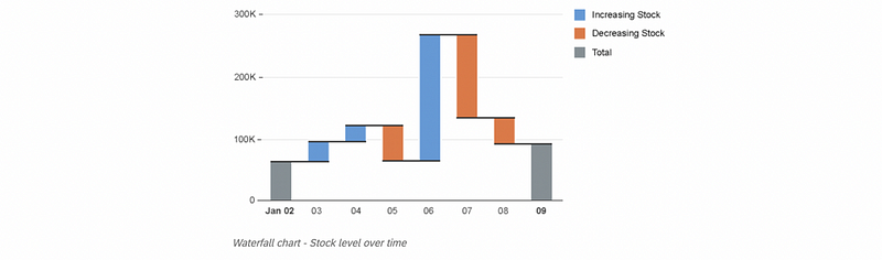
We must use different colors for the inflows (increases) and the outflows (decreases) because it is more clear and direct for the audience. Here is a bad example of how to use different colors. You can find that in this chart, the inflows and the outflows are unclear and it takes time for the audience to figure out the difference in these changes.

(10) Horizontal Bar Charts
Horizontal Bar Charts are also commonly used in business settings. If you have a very long category name, which can happen quite a lot in practice, then it will be a very good idea to plot this kind of chart.

It is important to know that sometimes we have to order the categories. To order a category, we have to follow some rules:
- If there is a natural order, so use that
- If there is no natural order, record to ease the interpretation process, like ordering by value
- The value on the top should be the most important
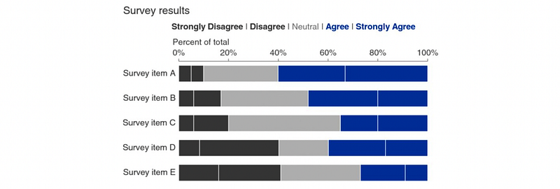
A special kind of horizontal bar chart is a 100% stacked horizontal bar chart. Suppose we have different questions in a survey and we want to check the percentage of the agreement and the disagreement somehow, so it can be quite easy to figure out the proportion of each answer.
(11) Pie Charts: They are evils and never use them!
For most people, pie charts can be used quite a lot. But in fact, the pie chart can give incorrect information and mislead the audience. The most famous case here is a distorted 3D pie chart made by Steve Jobs, from which he makes the market share of the apple looks bigger than its competitors. Another case is that you may find it really difficult to compare Supplier B and C in the right image. It can be the situation that the Supplier C has more share of C because of the distorting. So make sure the pie charts are never going to appear in your report unless someone is going to kill you 😆. You can find more bad cases from Edward Tufte.
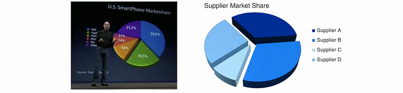
To make things way better, it is a good idea to change the pie chart to bar charts or as we just said, the 100% stacked horizontal bar chart.

Another rule is that unless you have 3-dimensional data and you must use 3D to plot them (for example, for some scientific charts), you will never use a 3D plot in any business settings. The reason is that the 3D plot can be distorted and it is ugly most of the time, so just avoid using them. Here is another example,

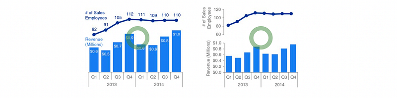
(12) Twin Axes Chart: avoid them
Sometimes we use the secondary y-axis to put two charts together in just one graph. But it takes some time and reading to understand which data should be read against which axis. During that period of time, the audience may start reading and not listening to the presentation.

Instead of doing so, we could either separate the graphs or just simply remove all the y-axes (with values tagged along with the graph). For example,
2. Form Follows Function
(1) Visualizations are not arbitrary
Objectivity, precision, and functionality constrain the forms they take. And we should also think about beauty.
(2) Ask: What is this for? This can give us very different points
- Present data
- Allow comparisons
- Organize
- Make relationships / correlations
(3) Final Question: Is it good at any of these?