Data Visualization Design 3 | Visual Perception and Principles of Design
Data Visualization Design 3 | Visual Perception and Principles of Design

- The Door Study
Let’s first watch a video about the famous door study.
In many of these situations when we think we are looking at everything but we are actually paying our attention to something specific. About 50% of the people in this experiment didn’t notice the change in this situation. Perhaps they are focusing on their task of finding ways so they are quite distracted from the person’s face.
So it is also clear that when we started to talk about things, we actually focus on the specific things instead of the whole picture. The reason why this is useful for visualization is that if we know better about how people tend to different details of different things. Maybe we can design our plots in a way that is going to be more effective. So that’s basically the idea.
In fact, the way we’re going to work is that we attend to just specific things at any given instant and we have this working memory that we keep just certain things that we need or the things that are useful to our task. It is also important to know that working memory has a small capability. To understand this is to understand the situation that the design of visualization should base on our understanding of visual attention and pattern perception.
2. The Goal of Visual Design
(1) The Definition of the Visual Queries
The visual thinking basically consists of a series of acts of attention driving eye movements and turning our pattern-finding circuits. The goal of it is to try to respond to a particular task.

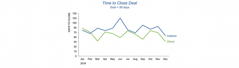
For example, if we are trying to figure out what is the fruit that has the largest import by the above graph, we are going to do is:
- Read the y-labels
- Look at all these bars
- Find the tallest bars
- Read the x-labels
- Get the conclusion
Another example is that if we want to find a fast route in a map, our visual queries will be:
- Find the starting city
- Find the ending city
- Look at all the orange lines that connecting these two cities
- Find the shortest line
- Get the conclusion

(2) The Goal of Visual Design
You want to find a visualization display whose visual queries are processed both rapidly and correctly for every cognitive task that the display is intended to support. Here are some questions that you may ask yourself before the implementation of the visualization design:
- What are the tasks that we want to support?
- Is that make sense to support these tasks with a particular visualization?
- What are the things that we expect people to do in their queries?
- Could we support them to be fast?
- How well does a visualization design support likely visual queries of users?
- What tasks does the user need to accomplish as a result of what visual queries should design support?
- What visual queries are easily executed?
- How to map data to colors, marks, space to efficiently service those queries?
Let’s now watch a video of the London underground map here.
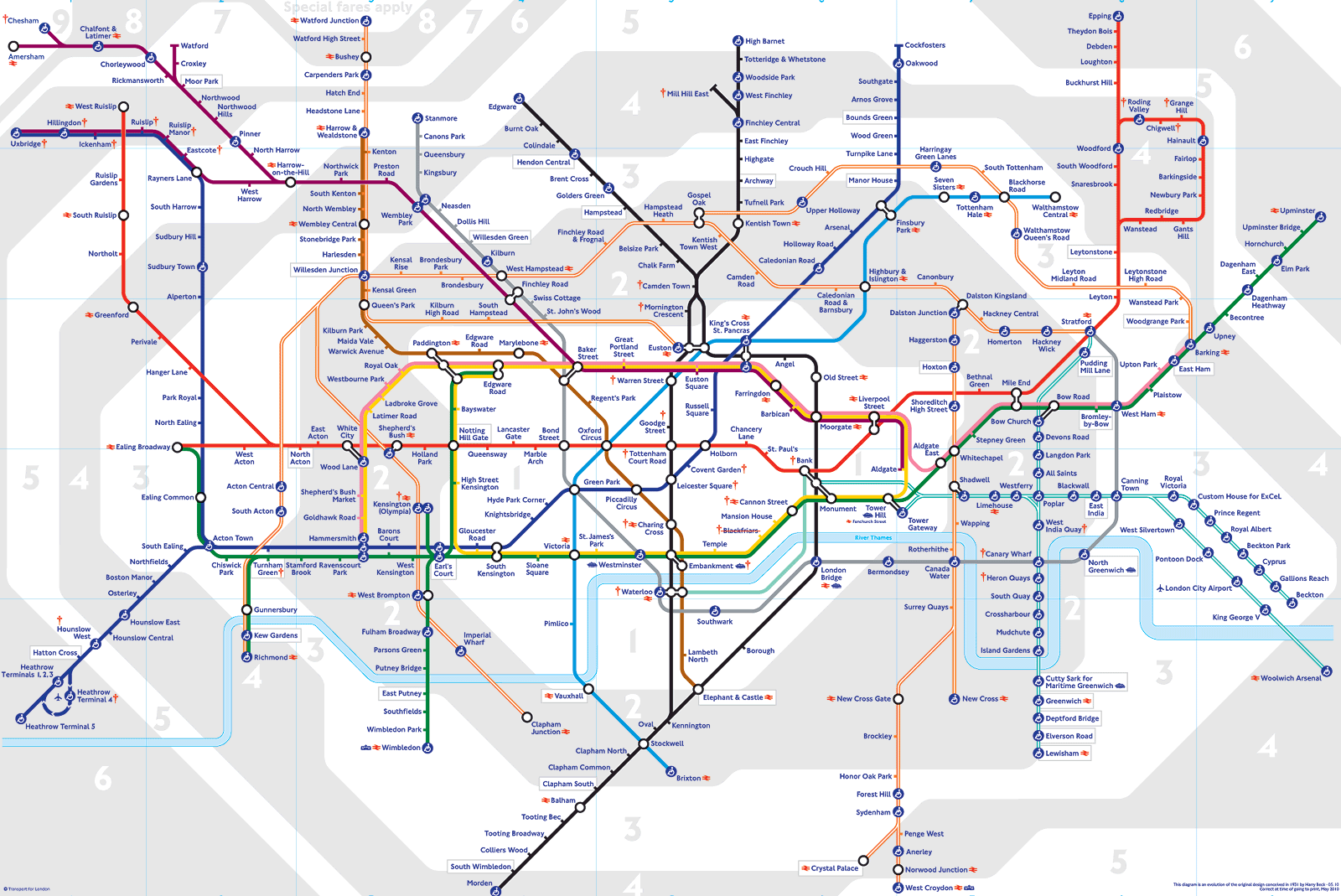
In fact, there are somethings we can do with this map and there are also many things we can not do with this. The visual queries that this map is supposed to support are:
- The combinations of the routes between two stations.
- Which one should be the shortest route?
- From which station can we transfer trains
- The number of lines we are in
- The relative position and distance between two stops
The visual queries that this map is not supposed to support are:
- How long does it take for each route?
- How much will it cost for each route?
- The exact distance between the two stations.
Actually, this is a map firstly designed by Harry Beck, and the reason why he designed such a thing is that he believed that Underground passengers were not concerned with geographical accuracy and were more interested in how to get from one station to another and where to change trains.
3. The Gestalt Principles
(1) The Goal of Highlighting and Contrasting
If want to make a graph symbol that can be found rapidly, the best thing is to make something highlighted. The evaluation has made us form a quick sense of discrimination between the background and the foreground, so human brains are adapted to finding the boundaries. Here are some examples,
(2) The Gestalt Principles
This is a theory of visual perception that is developed by German psychologists in the 1920s and it basically says something about people’s intention to organize visual elements into groups or unified wholes when certain principles are applied. There are six principles: similarity, continuation, closure, proximity, figure & ground.
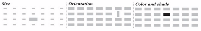
(3) The Definition of Preattentive Features
The features like size, orientation, color, and shade of shape are called preattentively or as we called the preattentive features. This name is because we actually see them and percept them before we really think about them. This is to say that we process them rapidly without conscious actions. By some experiments, it can take less than 0.5 seconds for the eye and the brain to process a preattentive property of any image.
(4) Proximity Principle
Objects that are close to each other tend to be perceived as natural groups. We usually use this in the bar charts, when we put some bars together to show that they belong to one single category.

Another interesting thing is that we can sometimes give more information or mislead people by forming texts in that way. For example,

say that we have two matrices, and you can say rows in the first graph, while lines in the second graph. This is not because of any difference in these texts but because in the first graph, we have more spaces between lines and the second one with more spaces between columns.
The application of this principle into the data visualization context is,
- Directly label the data: instead of giving the label by legend, we put it directly into the graph
(4) Similarity Principle
What the similarity principle says is that the identical objects will be perceived as belonging to a group. The application of this principle into the data visualization context is,
- Make labels the same color as the data
(5) Connectedness Principle
This principle says that the objects linked by means of a graphics artifice (for example, lines) will be perceived as members of a natural group. And it is important to keep in mind that the connectedness overrules the previous principles for grouping. Even all the shapes and colors of markers are different and located in distance, we can still see them in a group if we draw a line between them.
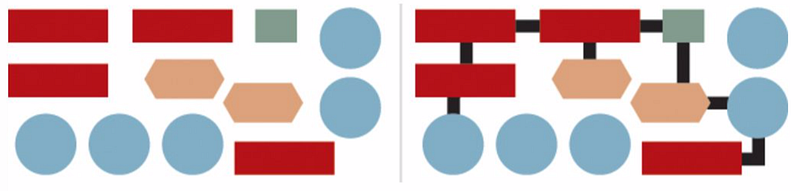
The application of this principle into the data visualization context is,
- Connect different data together: for example, we can connect the text to the bars by drawing a line between them
- Line plots are naturally connected: every line chart can be considered as an application of this principle.
(6) Continuity Principle
The principle continuity refers to the tendency to group together forms of similar shape, pattern, color, etc. It is usually better for us to examine continuity if the shapes are curves rather than lines with sharp angles. For example,
(7) Closure Principle
The closure principle refers to the objects inside an area with crisp, clear boundaries (edges of rectangular or shades) will be perceived as belonging to a group.
The application of this principle into the data visualization context is,
- Group items with line boundaries,

- Group items with shades

4. Function Orientated Graphing
(1) Golden Rule of Choosing Graphics
In general, we have to choose the graphics based on how visualization works.
(2) Ranking Graphics by Accuracy
By experiments, from the highest accuracy to the lowest accuracy of different graphics are listed as,
- Position along with a common scale (i.e. bar charts)
- Position along with nonaligned scales
- Length
- Direction
- Angle
- Area
- Volume
- Curvature: Human brain has difficulty comparing angles, directions, and curvatures.
- Shading
- Color Saturation
The conclusion is that a bar chart is always superior to a bubble chart or a heat map if the goal of the graphics is precise comparisons. When the goal is to allow readers to make accurate comparisons, a chart based on bars or lines sitting on a single horizontal or vertical axis beats other representations.
(3) Different Graphics Serves for Different Functions
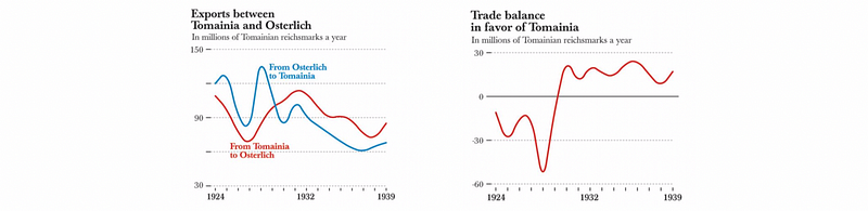
In fact, there are no exactly bad graphics and also there are no exactly good plots. All we have is the goal of drawing and we have to find out does our graph properly supports our goal. So it can be totally different if we serve different goals. For example, if we want to compare how much each nation exports to the other, we have to draw two lines, but if we want to display the balance between the two nations, it would be perfect if we show a single line.
(4) Other Function and Choosing Graphics
We have many other functions to serve instead of making a precise comparison or showing accuracy, we have to choose other graphics. For example,
- Estimating Proportions: dot chart or bar chart
- Comparing Values and Seeing the Relationship Between Variables: scatter-plot or slope graph
- Avoid using bubble size for showing proportional to the encoded numbers
- Avoid using a heat map to show the relationship between two variables
5. Clutter is your enemy
(1) Common Clutter Issues
Because every single element you add to that page or screen takes up cognitive load on the part of your audience — takes them brainpower to process. Some common faults of clutters are as following:
- Lack of visual order
- Alignment #1: shift from center to left-justified text
- Alignment #2: diagonal components should be avoided
- Remain proper white space
- Clear contrasts
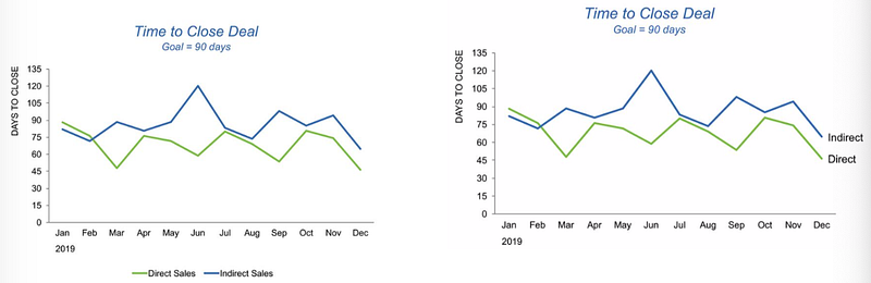
(2) Decluttering: step-by-step
- Chart borders are usually unnecessary
- Gridlines should be removed or muted
- Remove data markers. In this plot, they don’t help
- Clean up axis labels (trailing 0s). Fix the x labels
- Label the data directly using the principle of proximity
- Leverage consistent color