Data Visualization Design 4 | Lab: Basic Matplotlib
Data Visualization Design 4 | Lab: Basic Matplotlib
- A Matplotlib Template
For all of the matplotlib problems, first of all, we must have this template as our starting point.
2. Common Plots and Commonly Used Parameters
(1) Histogram
ax.hist(seq_1, bins)
- seq_1: our data
- bins: it defines the number of equal-width bins in the range.
(2) Scatter
ax.scatter(seq_1, seq_2, marker, s)
- seq_1: our data 1
- seq_2: our data 2
- s: the marker size (not string, this is a common misunderstanding in matplotlib)
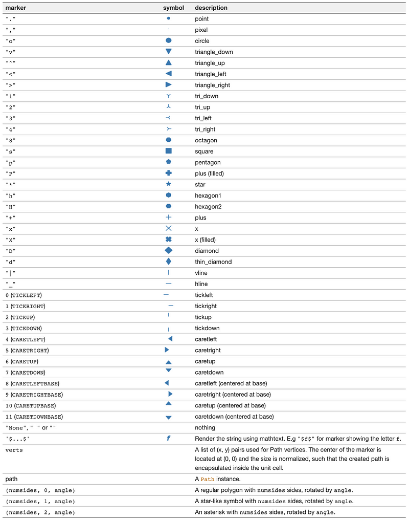
- marker: the symbol of the markers
(3) Bar/Barh
ax.bar(seq_1, seq_2, width)
ax.barh(seq_1, seq_2, width) # horizontal bar
- seq_1: our data 1
- seq_2: our data 2
- width: the width of each bar, by default = .75
(4) Plot
ax.plot(seq_1, seq_2, marker, lw)
- seq_1: our data 1
- seq_2: our data 2
- marker: the symbol of the markers, by default None
- lw: line width, by default = 1
(5) Boxplot
ax.boxplot(seq_1, showfliers)
- seq_1: our data
- showfliters (bool): False means not showing outliers, by default True
(6) Violin Plot
ax.violinplot(seq_1)
- seq_1: our data
(7) Text
ax.violinplot(x, y, string)
- x: position x
- y: position y
- string: our input string
(8) Fill
ax.fill(seq_1, seq_2, color)
- seq_1: our data 1
- seq_2: our data 2
- color: the fill-in color
(9) Vertical Line
ax.axvline(x, ymin, ymax)
- x: position x
- ymin: the minimum value of y
- ymax: the maximum value of y
(10) Horizontal Line
ax.axhline(y, xmin, xmax)
- y: position y
- xmin: the minimum value of x
- xmax: the maximum value of x
(11) Twin Line Plot
ax_new = ax.twinx()
ax_new.plot(seq_1, seq_2, marker, lw)
3. Global Parameters for Plotting
You can also refer to Line2D properties and Text properties and layout for further details.
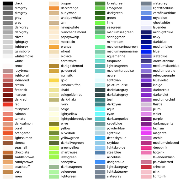
- color: assign the fill-in color
- edgecolor: assign the edge color
- cmap: set the color map, see this link for more info
- mec: marker edge color
- alpha: the transparency
- ms: marker size
- label: attach a label and shown in the legend
- ha: or horizontalalignment, [
'center'|'right'|'left'] - va: or verticalalignment, [
'center'|'top'|'bottom'|'baseline'] - weight: the font weight, [
'normal'|'bold'|'heavy'|'light'] - fontname: the font name, i.e. [
'Times'|'Arial'| …] - fontsize: the font size
- rotation: rotation for a certain degree
- position: set the position of the anchor
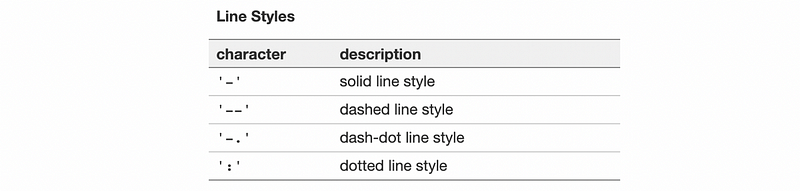
- ls: line style, could be set as follows
4. Configure the Axes
(1) Set Axis Color
ax.spines['top'].set_color(color)
ax.spines['right'].set_color(color)
ax.spines['left'].set_color(color)
ax.spines['bottom'].set_color(color)
- color: the color we want to set
(2) Set Axis Visibility
ax.spines['top'].set_color('None')
ax.spines['right'].set_color('None')
ax.spines['left'].set_color('None')
ax.spines['bottom'].set_color('None')
or,
ax.spines['top'].set_visible(False)
ax.spines['right'].set_visible(False)
ax.spines['left'].set_visible(False)
ax.spines['bottom'].set_visible(False)
(3) Set Axis Bounds
ax.spines['left'].set_bounds(a, b)
ax.spines['bottom'].set_bounds(a, b)
- a: starting point
- b: ending point
(4) Set Axis Line Width
ax.spines['left'].set_linewidth(w)
ax.spines['bottom'].set_linewidth(w)
- w: the width we would set here
(5) Set Axis Range
ax.set_xlim(xmin, xmax)
ax.set_ylim(ymin, ymax)
- xmin: the minimum value of x
- xmax: the maximum value of x
- ymin: the minimum value of y
- ymax: the maximum value of y
5. Set Ticks and Labels
(1) Set Tick Values
ax.set_xticks(list)
ax.set_yticks(list)
- list: the list of values we want to set for the ticks
(2) Set Tick Labels
ax.set_xticks(range(len(list)))
ax.set_xticklabels(list)
ax.set_yticks(range(len(list)))
ax.set_yticklabels(list)
- list: the list of labels we want to set for the ticks
(3) Set Tick Colors
ax.tick_params(axis, colors)
- axis: choose axis to set, [
'x'|'y'|'both'] - colors: set color
(3) Set 0 to Tick Dash Length
ax.tick_params(axis,length=0)
- axis: choose axis to set, [
'x'|'y'|'both']
(4) Set Legend
plt.legend(loc, bbox_to_anchor)
- loc: the location of this legend
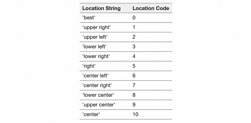
- bbox_to_anchor: refer to this link
(5) Set Labels
ax.set_xlabel(string, c)
ax.set_ylabel(string, c)
- string: the label
- c: the color
6. Set Annotation
(1) Add Arrow & Text
ax.annotate(string, xy, xytext, arrowprops=dict(arrowstyle="->"))
- string: the text we want to add
- xy: tuple, the point that the arrow pointing to
- xytext: tuple, the position where the text located
(2) Add Triangular Annotation
import matplotlib.patches as patches # for drawing shapes
tria = [x, y, z]
tria = np.array(tria)
wedge = patches.Polygon(tria, closed=True, facecolor='black')
wedge.set_clip_on(False)    # allow to draw outside the axes
ax.add_patch(wedge)
ax.text(a, b, string)
ax.set_ylim(ymin, ymax) # set the limitation of the y-axis
- x: the position x of a triangular
- y: the position y of a triangular
- z: the position z of a triangular
- a: the position x of our text
- b: the position y of our text
- ymin: the minimum value of y
- ymax: the maximum value of y
7. Set Title
ax.set_title(string, position, fontname, fontsize, c)
- string: our title
- position: the position of this title
- fontname: set the font name
- fontsize: set the font size
- c: the color of the title
8. Matplotlib Cheatsheet
Find them on the GitHub link: https://github.com/matplotlib/cheatsheets