Data Visualization Design 5 | Hierarchy, Stephen Few’s Rules for Color, Palettes, Multivariate…
Data Visualization Design 5 | Hierarchy, Stephen Few’s Rules for Color, Palettes, Multivariate Visualization

- Memory
(1) Iconic Memory
The iconic memory is a kind of memory that happens before we consciously realize it. After this process of iconic memory, some of the information passes through a short-term memory, and after that, this information turns into long term memory.
(2) Preattentive Attributes
Because the iconic memory is the first thing that happens when we see a visualization, then the attributes called by this are also called preattentive attributes. The common preattentive attributes are as follows,
- Orientation
- Shape
- Line Length
- Line Width
- Size
- Curative
- Added Marks
- Enclosure
- Hue
- Intensity
- Spatial Position
- Motion
If we want to use the preattentive attributes is that if we want them to work effectively, we should not use them frequently. On the one hand, we could use these attributes to give out hints so that the people/audience know what to read from your slide or how to organize the information. Another thing is that we can create a hierarchy of different information so people the audience can have a sense of the order of the information, which one to read first, and which one goes the second.
(3) Hierarchy of Information
Sometimes, when we are writing articles, we also use this to give more information. For example, we use bold, color, italics, size, separate spatially, outline(enclosure), underline(add markers), etc. to draw people’s attention.
In order to create a visualization with hierarchy information, we should then think about the preattentive attributes. Firstly, we can make the information much easier for our audience to understand. Then, secondly, we should give our audience direct instructions on how to process this information through a visual hierarchy.
One thing to be kept in mind is that we can only have 3 to 8 seconds from our audience before they decide whether to continue looking at the things you delivered or turn their attention into something else. Sometimes it is not because the information themselves are not interesting but the audiences have no clue where to read in the first place. If you don’t give that order, they may decide not to look at that thing.
(4) Short-Term Memory
During the short-term memory, we keep all the small amounts of information that is given at some time and then these memories passed to the long-term memory.
(5) Long-Term Memory
The images that can help us quickly recall things is because of long-term memory.
2. The Importance of Size
The importance of size is basically because the relative size of an object implies the relative importance of something in a graph. So if we are showing something with similar importance, it will be clear if we assign them with the same size. However, if something is more important then the others, make sure to make it big.
3. Color
(1) The Definition of Hue
Hue is the pure color, basically as we called red, green, blue, and yellow. It is also the gradation or attribute of a color that defines its general classification as a red, blue, yellow, green, or intermediate color.
(2) The Definition of Intensity
In general, the intensity of a color is defined by how less grey it has. It is also called chroma or saturation. It refers to the brightness of a color. Color intensity can be changed by adding black, white, gray, or an opposite color on the color wheel.
(3) Usage of Selectively/Intentional
We have three rules here. First of all, we use a selectively unique high-intensity color to highlight important parts. This color is used in order to draw the attention of the audience. Secondly, the colors should be used intentionally, it is used to highlight the things that we want to stress. We can also use gray plus any color to draw people’s attention.
(4) The Lost Table
Now let’s have a look at the following table.
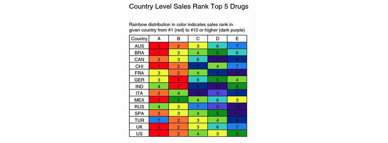
Well, this can be somehow impressive but it is actually not clear about the information that they would like to draw. If we look into details, we can find out that the color of red means more sales, while purple means fewer (rank #1 to #10 from red to purple). All the colors are bright and from the rainbow colors so it seems like they are shouting at you.
A good idea is to put this rank outside the table and use the shade of one single color. This will give as a clear insight and by this means, our audience can have a better understanding of these data.
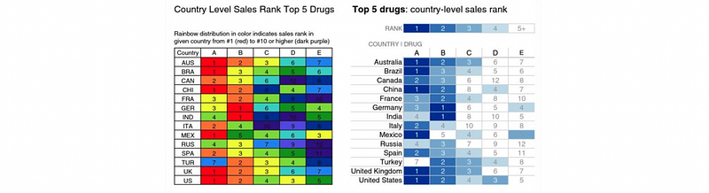
Some people think that people may get bored with one single color, but in fact, they do not. People sometimes use many colors in a single visualization in order to make a beautiful chart but they actually make the things wrong, because they lost the consistency of the colors and it will add the time for our audiences to understand. So if we want to use red for highlighting, make sure that all the other highlights are in different shades of red, or it will turn out to be a disaster.
So the key point is the audience will not be bored if you don’t use many colors. They will be bored if they find out that it can be difficult to understand a plot or a graph. And of course, the more colors in the graph, the harder it is for the audience to understand. If you want to save their time for understanding, make sure that your colors are consistent.
(5) Colorblind Issue: Avoid Using Shades of Green and Red
Keep this thing in mind, about 8% of the men and 0.5% of the women in the population are colorblind so that they can have difficult to distinguish different shades of green and red. So just avoid using green and red to compare things. Use some colors else.
(6) Colors in a Culture Context
Different colors have different kinds of meaning, but this can depend on the culture settings of this culture. Another thing to keep in mind is that you should always care about the implied meanings of colors when visualization or it will cause some unrealized problems. See this link to get more information.
4. Stephen Few’s Rules for Color
- Rule #1
If you want different objects of the same color in a table or graph to look the same, make sure that the background — the color that surrounds them — is consistent.
For example, in data visualization, we can use the same color of the background to imply the information is from one unique group.
- Rule #2
If you want objects in a table or graph to be easily seen, use a background color that contrasts sufficiently with the object.
For example, in data visualization, if it is hard for the audience to read between the texts, we can change the background color to make the tests visually clear.
- Rule #3
Use color only when needed to serve a particular communication goal and don’t use color to decorate the display, because this adds clutter.
For example, in data visualization, we can create a clear visual hierarchy by using the shades of a color. But if we haven’t got a specific purpose, it is not a good idea to use colors for decorations.
- Rule #4
Use different colors only when they correspond to differences of meaning in the data.
For example, in data visualization, if we have different categories, we can use different colors to distinguish between them. However, we can not use different colors if we have only one category (i.e. assign a different color to every element in this category), this can ruin the presentation. The different colors used should help us understand the data in a better way.
- Rule #5
Use soft, natural colors to display most information and bright and/or dark colors to highlight information that requires greater attention.
For example, in data visualization, we use brighter or darker colors to support three kinds of goals: (a) to highlight particular data; (b) to group items; (c) to encode quantitative values.
- Rule #6
When using color to encode a sequential range of quantitative values, stick with a single hue (or a small set of closely related hues) and vary the intensity from pale colors for low values to increasingly darker and brighter colors for high values.
For example, in data visualization, we use different palettes for different data types. You can view this link for further information.
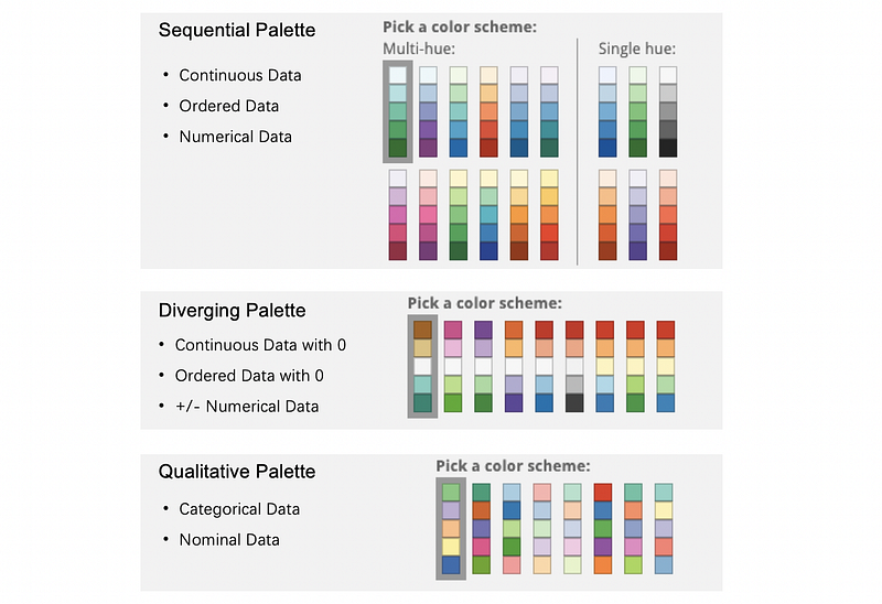
You have to understand the difference between the sequential palette and the diverging palette. A sequential palette ranges between two colors, while the diverging palette ranges between three or more colors (typically three colors) with the different colors being quite distinct (usually two contrast colors with an opposite position in the color wheel, along with white, or grey, or black).
In order to use a diverging palette, we have to make sure that there is actually a value of importance or a zero value that around this value, the data are to be compared.
We use a sequential palette for continuous variables because the colors of the increasing intensities could be perceived as the number of increasing values. We don’t use colors of different hues because the hues are not perceived as the increasing numbers (we can not order different hues but we can order different intensities). We usually use this rule in the choropleth map (a form of the geographic heatmap).
- Rule #7
Non-data components of tables and graphs should be displayed just visibly enough to perform their role, but no more so, for excessive salience could cause them to distract attention from the data.
For example, in data visualization, if we must use axis lines, we use thin gray lines of medium intensity; If we must use borders, whether around the graph as a whole, its plot area, or a legend when borders are needed (usually they are not), use him gray lines of medium intensity. For the background, we simply use white for most of the situations.
- Rule #8
To guarantee that most people who are colorblind can distinguish groups of data that are color coded, avoid using a combination of red and green in the same display.
We have talked about this above, so the idea is simply to avoid using red and green on the same display at any time.
- Rule #9
Avoid using visual effects in graphs.
For example, in data visualization, never use a 3D graph. It is also going to be proper for us if we use the semantic encoding for our graph. All the colors present in the graph should be naturally related to the meaning of the thing it represents if there is a natural color. For example, on a map, we have to use blue for the ocean, and green for the land. We also use red or white for the roads. So the common sense is relatively important in these kinds of graphs.

5. Multivariate Visualization
(1) Bubble Charts
We can use the bubble charts to represent four variables (maximum four dimension chart). The position of the bubble, say (x, y), are two continuous data (numerical variable). Then the bubble size could also be a numerical variable along with the color of each bubble represents numerical data or categorical data.
It will be a good idea to change the colors of the bubbles if we are incorporating negative values.

There are actually many concerns about using this bubble chart.
(a) Bubble size can roughly be used for comparison
A common misunderstanding is the circles should be compared by the area, not by the diameter. While for the audience, it can be hard to compare the areas because the human eyes are not sensitive to the areas.
(b) Obscuring data can be an issue
This issue occurs when the density of the bubbles are great. The large circles should behind the smaller ones or we can use transparency for representing.

(c) The bubble chart cannot present a trend
It is hard for a bubble chart to represent a trend even though the bubble charts have continuous x and y. So the most important variables of this bubble chart should be on the x- and y-axis, and also, avoid using the third variable (bubble size) if it doesn’t support our goal of telling a story.
(2) Heatmap
The heatmap is good for encoding data and this is quite important for us as an alternative to the table. In order to encode data, we have to encode data with its horizontal position and its vertical position, and then we change the intensity of the box color, and this is related to the values (numerical or categorical) of each entry. The heatmap essentially showing the whole dataset but replace numbers by different color values, so it is easier for the audience to read.
(a) Clustering is a good practice for heatmap
In biology or medicine, we use a lot of heatmaps. It is a good practice if we cluster (in some way) the data in the heatmap because it shows the structure of the heatmap.
(b) Heatmaps for user sessions by day/hour
Look at GitHub contributions, it can be a good way to examine the session of the users in a simple and clear way. This can be time-series data by categorical data.
(c) Heatmaps are good for certain types of data, like well-suited continuous data or the unordered categorical data (within 7 categories).
(d) Heatmaps encourage comparison and pattern finding
We can use the heatmap to sort the change of patterns, and also the heatmap works for hierarchical clustering which we are going to say in the part of machine learning.
(3) Scatterplot Matrix
If we have a bunch of different variables and we would like to see their relationships, this can be useful for us. We can compare each of these variables together and then find out the relationship between them. You can also think about the combinations by all the variables.

(a) The scatterplot is good for exploration and comparison, we can easily find out the linear correlation between multiple variables.
(b) Scatterplot works with numerical or ordered data, the scatterplot is basically for finding the relationship and distribution of two variables, so it would be meaningless if we analyze the categorical data in this way.
(c) The scatterplot is a kind of small multiples, which we are going to talk about immediately
(4) Small multiples
One we can do small multiples is to separate plots by category and represent them separately. This is to say that it can be perceived as sets of subsets that are separate by a categorical variable. Then we create a small plot that represents each of the subsets in this set and shows all the subset on the same page. For example,
(a) Small multiples are excellent for comparison, but this depends on how to place these small multiples
(b) Small multiples must have a variable that is used for grouping, this variable can be discrete or categorical data.
(c) We can use any type of plot in the small multiples, but because each of the small plots is quite small, so it is hard for us to tell the exact values in each plot.
(5) Parallel Coordinates
The parallel coordinates are set by, first of all, create one vertical line for every column (numerical or ordered data). On each of the column lines, we put points on every lines (y is the value for that column) and we then connect every point with a line and so as to create a parallel coordinates.
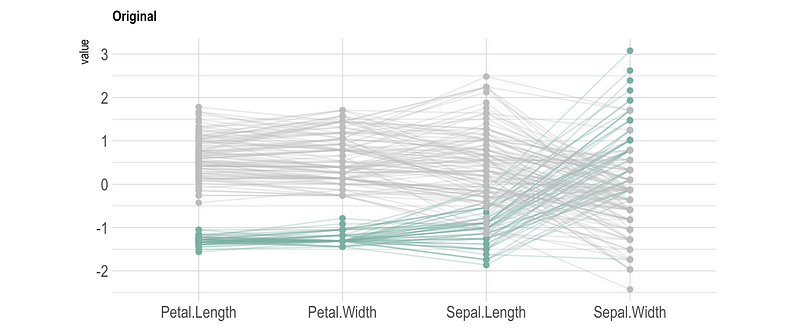
However, ther are some problems of this parallel coordinates.
(a) They are always required interactivity. We have to carefully choose the columns to color by and choose how to sort the values. It is also a good way to make some brushing highlighting in this graph.
(b) The order of the axes impact how the reader understands the data. This is because the relationships between adjacent dimensions are usually easier for people to perceive than between the non-adjacent dimensions. So it is a wise idea to avoid using adjacent dimensions that will not give any insights.
(c) Each axis can have a different scale, which is difficult to display and for the reader to absorb.