Data Visualization Design 7 | Highlights, Distractions, Hierarchy, and Text
Data Visualization Design 7 | Highlights, Distractions, Hierarchy, and Text

- Highlighting
(1) Main Principle of Highlighting
The main principle of highlighting is that at most there can only be 10% of the visual design that should be highlighted. To highlight a specific thing in the graph, that must be important to the storytelling.
(2) Ways to Highlight
Bold, italics, and underlining can be used for titles, labels, captions, and short word sequences to differentiate elements. Although the bold is the most preferred one compared with the others. The problem for underlining is that it actually adds to the clutter and the problem for Italics is because it doesn’t stand as much as we expect.
We can also use upper cases and typeface for highlighting but this can also add to the clutter.
Color is a good way to highlight something we want if this appears infrequently, and it is also a feature related to bold that we usually use them together. Our final option is to change the size of the texts and the larger they are, the more important they will be in a plot.
2. Eliminate Distractions
(1) Common Distractions
- Clutter: the element that doesn’t add information
- No Context: need to give more information so that your point makes sense
(2) Identity Distractions
In practice, not all the data in a plot are equally important so that we can get rid of some of them to make a plot more rational. It is important to know that when the details are not important, we have to summarize them and remember the details in case we are asked about them.
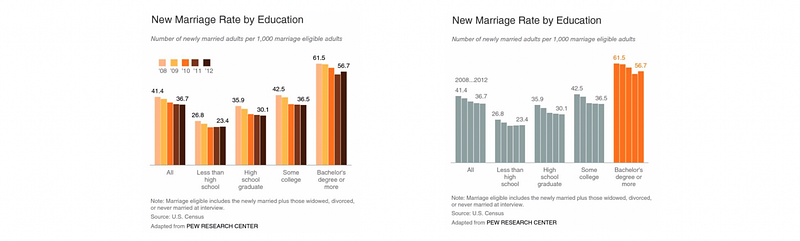
To deemphasize elements that are necessary but don’t impact your message we can use light grey for plotting them so the audience knows that they are going to be less important than the others.
3. Create Hierarchy
(1) The Definition of the Hierarchy
The sequence that we expect the audience to go through in plots is the hierarchy that we have designed in the plot. This is a key element of visualization because people can know what to do without any further instructions.
(2) Tools for Hierarchy
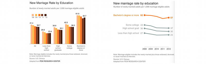
To set up a hierarchy, we can firstly use different sizes and colors and they would tell the people where to start reading and what is the order. We can also highlight the most important part and this helps the audience quickly process the information.
4. Add Proper Texts
(1) Where To Use Texts?
First of all, all the graphs need titles. It is also that every axis needs a label to explain the meaning of the variable. You can also annotate important points directly on the graph and also put some important footnotes (source, date, necessary assumptions, methodologies).
(2) Golden Rule
Never assume that the plot will be telling the same story if you imply a conclusion. If you want to draw a conclusion, state it in direct words and then attach the statements to the graph.