Time Series Analysis 3 | Computational Autocorrelation Function, ACF Plot, and ADF Test
Time Series Analysis 3 | Computational Autocorrelation Function, ACF Plot, and ADF Test

- Computational ACF
(1) Recall: Population/Theoretical ACF
Recall the ACF of a time series {X_t} of population/theoretical should be,

Particularly, when {X_t} becomes stationary, the ACF will just depend on h,

So,

(2) Recall: The Definition of Correlation
Recall for random variables X and Y, we have

This is also,

So if we take a sample from X and a sample of Y, we use average to estimate the sample correlation. Then the formula becomes,

(3) Recall: Population/Theoretical ACVF
Recall the population version ACVF is,

(4) Twisted Computational/Sample ACVF
If we use the same sample size for t+h and t here, and this is, therefore, called a first twisted ACF (means the result can be biased). Based on the previous discussion, the sample version 1st twisted ACF should be,

For simplification, if we use the same sample mean for {X_t} and {X_(t+h)}, we are using a second twisted version ACF. However, this case also has a downside because we just use the ground mean of the whole sample, and this is not very accurate.

The 3rd twisted version should be even simpler because we don’t want h to impact the outcome. Therefore, we just use n+1 in the denominator.

Note we have n+1 here because we assumed our time series from t=0. So there are n+1 elements. So generally, the sample ACVF we are going to use is the 3rd twisted version. Because of all the twists we have added, the sample ACVF is NOT an unbiased estimate of the population ACVF.
(5) Computational/Sample ACF
What’s more, this ACVF result used the assumption that {X_t} is stationary even when {X_t} is not necessarily stationary. So why do we do that? This is because it does give an approximate estimate of the autocorrelation, and more importantly, it reflects the change of seasonality in the time series.
So, we can still confirm the sample ACF function as,

2. ACF Plot
(1) The Definition of ACF Plot
The ACF plot of a sample is its autocorrelation values against the lag h. The key point of doing this is to know how ACF behaves differently with different time series so that we can detect the type of time series based on its ACF plot.
(2) Static Starting Point of (0, 1)
If we start at h = 0, then the ρ(0) should always be 1. So for any ACF plot, we can always find the plot starts from the point (0, 1).
(3) How to Read ACF Plot?
With h going up to n, the sample ACF can become very small and doesn’t reflect the real ACF anymore. So when plotting the ACF, we always follow these two steps,
- General View: plot ACF with h approximately equals n to see observe the general changes
- Zoom in: then zoom in with smaller h for only the beginning part of an ACF plot to get a more reliable conclusion.
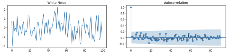
(4) White Noise ACF Plot Example
- Has (0, 1) point, but suddenly drop after that point
- Random patterns in the rest of the ACF plot, commonly with autocorrelation between -0.2 ~ 0.2. This means a weak correlation.
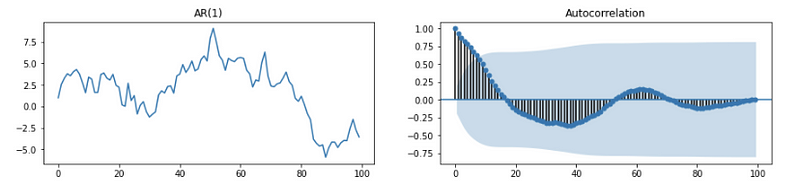
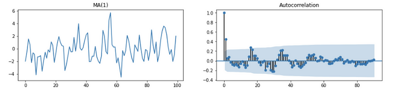
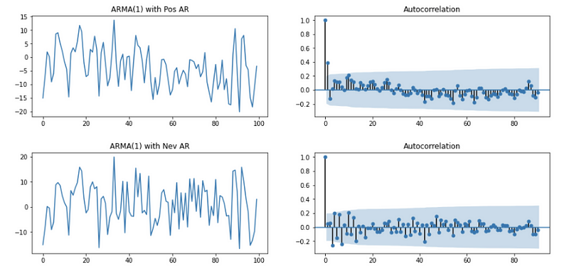
(5) Stationary Time Series AR(p), MA(q), ARMA(p, q) Example
If ACF doesn’t show the behavior with the obvious trend and obvious seasonality, then it is stationary.
The ACF of AR should be (when coef ϕ > 0 but stationary, e.g. ϕ = 0.8),
Or (when coef ϕ < 0 but stationary, e.g. ϕ = -1.2),
The ACF of MA should be,
The ACF plot of ARMA (general stationary time series) should be,
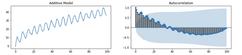
(6) Obvious Trend Time Series ACF Plot Example
So what is the obvious trend and seasonality? Let’s talk about them now.
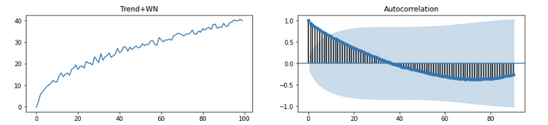
Looking at each pair’s relationship with the average value, when h is smaller, we have more positive terms in the sum, this will result in a larger ρ(h)-cap value. Then ρ(h)-cap will keep decreasing and the ACF value drops down. So But finally, it pulls back a little bit in the end. Why? This is because we have fewer terms but the sample size is still large. In the end, it may finally become the noise.
So the features of this kind of time series should be,
- Start from (0, 1)
- ACF value drop down to negative because we have more and more negative terms and fewer positive terms when calculating ACF
- It pulls back a little bit because of fewer terms
- Finally, become noises (may not appear)
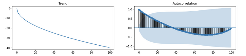
(7) Other Trend Time Series
- Think about a TS going down. Will the plot change?
No. This is because we still start from (0, 1), and the sign correlation should remain the same. The only difference is that we have negative multipliers in the first place but their products are still positive when h is small.
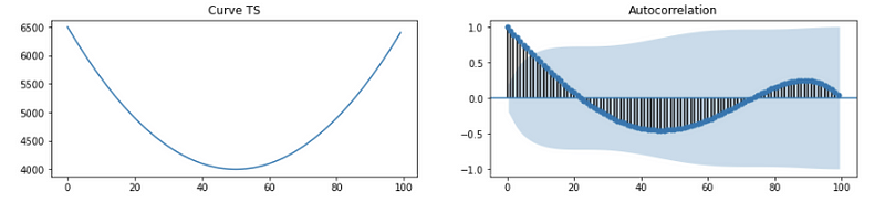
- Think about a curved TS. Why it shows this way? Think about it yourself.
(8) Obvious Seasonality Time Series ACF Plot Example
If h increases, the ACF value gets smaller, but the seasonal pattern remains. So the ACF plot of a seasonality time series model should be,
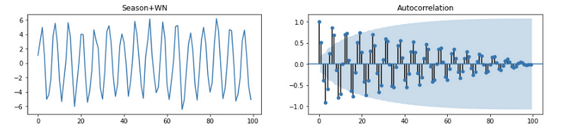
This plot has the following features,
- Start from (0, 1)
- Lag of two peaks or two troughs has a positive ACF value
- Lag of a peak and a trough has a negative ACF value
- Alternate periods of positive and negative ACF values
(9) Obvious Trend and Seasonality Time Series ACF Plot Example
This is probably the most common kind of time series plot we can generate from a real dataset.
3. Augmented Dicky-Fuller (ADF) Test
By default,
- H0: the time series is not stationary
- H1: the time series is stationary
By assuming AR(1) condition,

Then the original hypotheses are equivalent to,
- H0: |ϕ| ≥ 1 (Based on the proof of AR(1) stationary conditions)
- H1: |ϕ| < 1
When the P-value of the ADF test is less than 0.05 (assume the confidence level is 95%), we can reject the null hypothesis, and the current time series under testing is a stationary time series. In practice, the ADF test is good at picking out time series with trends as non-stationary, but it is bad at picking out time series with only seasonality as non-stationary.