Web Development 2 | CSS Formatting
Web Development 2 | CSS Formatting
- CSS Introduction
(1) Change the Background Color
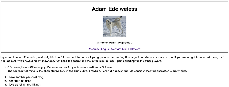
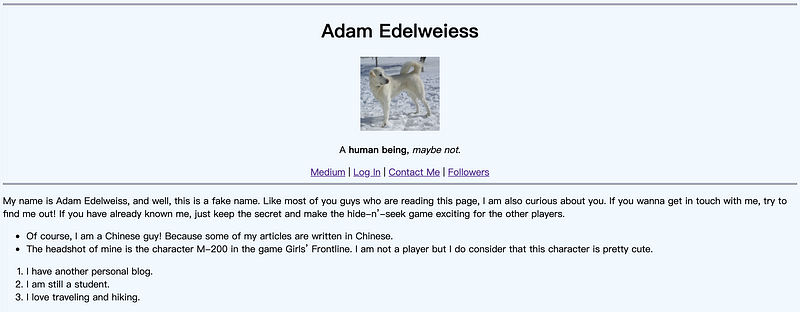
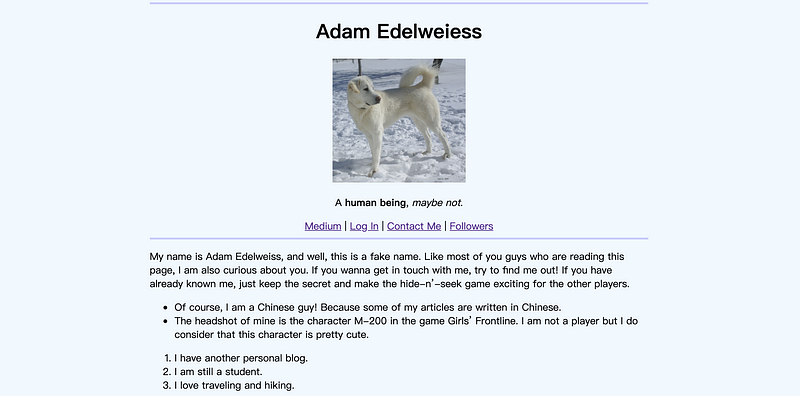
Now, recall what we have done in the last section. We have created a personal webpage and mine looks as follows,
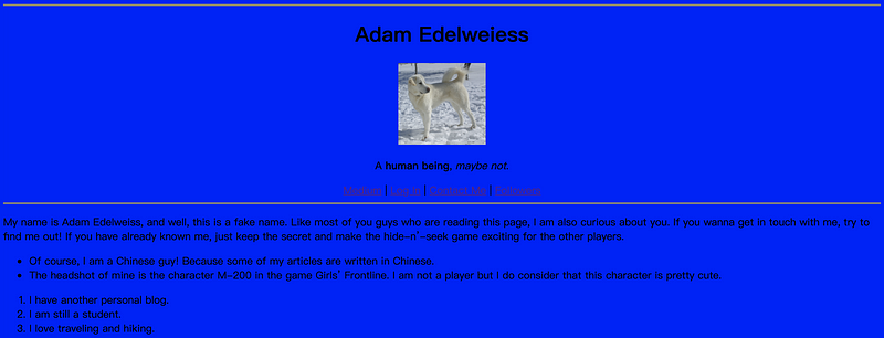
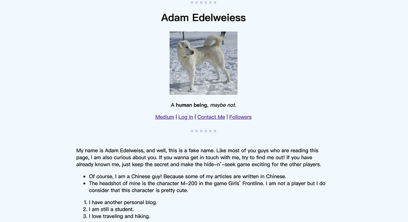
Now, let’s see if we want to change the background color of the whole page to blue, what can we do to help? The answer is that we can change the style attribute (which is also the CSS format) and add a rule of background-color: blue;.
<body style="background-color:blue;">
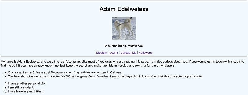
Eh, this is quite ugly. How can we find the right color for us to use? The answer is ColorHunt. We can go to this website and then find the color we need for our webpage. In this case, we are going to use the following color, which is #eff8ff,

Then,
<body style="background-color:#eff8ff;">
(2) Change the Color of the Horizontal Lines
Note that we have two horizontal lines on our page (two hr tags), and if we want to change the color of these lines, we have to change them one by one. However, we don’t want to manually do it when there are too many lines on the page and we may want to set a general rule for all the hr tags.
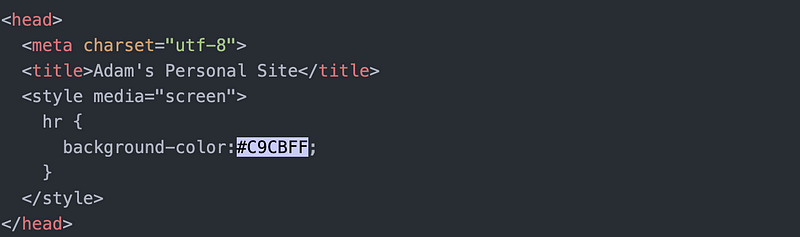
We go to the head part and then type in,
<style media="screen">
    hr {
      background-color:#C9CBFF;
    }
</style>
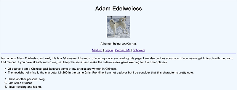
This is going to set all background colors for all the horizontal rows within this page. However, the page doesn’t seem like what we want (where you can find a border for each of the lines),
This is caused by the default values of CSS (reference).

If we want to delete the border of the horizontal lines, we can change the border-style to none or change the border-width to 0px,
border-style:none;
or,
border-width:0px;
Now the border is removed but there appears to be another problem: the width of our lines is too small to see. If we want to change the width for our horizontal lines, remember what we have learned from the HTML attributes, we can change the size attribute. However, what if we want to change the width for all horizontal lines? We can use the height under style instead of changing the size attribute,
height:3px;
(3) Combine All the Attributes
Let’s now write all the HTML attributes in the CSS format. We have to change the background color of the body to #EFF8FF and also we have to change the image to be displayed with a height of 200 pixels,
<style media="screen">
 body {
      background-color:#EFF8FF;
 }
hr {
background-color:#C9CBFF;
border-style:none;
height:3px;
} img {
height:200px;
}</style>
Then we can delete all the HTML attributes for our page.
(4) Change Alignment
Now if we want to make this page more like Medium (with articles in the middle and keep the white space on both sides), then we can add two more attributes to the body section under the style tag,
width:61.8%;
margin:auto;
(5) Formatting the Horizontal Lines
We can actually add more features to the horizontal lines with its border.
hr {
      background-color:#EFF8FF;
      border-color:#C9CBFF;
      border-style:none;
      border-top-style:dotted;
      border-width: 8px;
      width:10%;
}
Wow, it seems very ugly but it is perfect to show how we can use our horizontal lines.
(6) Change Style To CSS Script
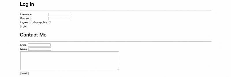
Because we have hardcoded the style to only the index.html file (this is called the inline CSS or internal CSS), then if we click on the login page and contact me page, it will not in the same format.
It is a bad idea to copy and paste the CSS script to all the pages that we want to add features (because it’s time-consuming and badly formatted). And a better idea is that we can add an external CSS for all the pages. To begin, we should create a new folder called css and then create a new file called style.css.
Secondly, we copy and paste all the rules into this file,
body {
  background-color:#EFF8FF;
  width:61.8%;
  margin:auto;
}
hr {
background-color:#EFF8FF;
border-color:#C9CBFF;
border-style:none;
border-top-style:dotted;
border-width: 8px;
width:10%;
}img {
height:200px;
}Thirdly, we add the link tag to headers for all the pages,
<link rel="stylesheet" href="css/style.css">
Then, refresh the page, we can find out that all the pages are in the new formation.
Note that the importance of the style is that HTML attributes > internal CSS > external CSS.
2. CSS Syntax
(1) The General Template of CSS
In CSS, selectors are patterns used to select the element(s) you want to style (WHO). The CSS properties specifies what to style of the targeted HTML elements (WHAT). The CSS value is how we want to change the style of the targeted HTML elements on the given property (HOW). For example,
selector {
    property:value;
}
(2) Tag Selectors
For CSS, the selector can be any tags (i.e. h1, p, a, etc.). For example,
h1 {
   color:red;
}
(3) Class Selectors
In the HTML file, suppose we have many different images and we would like to set different sizes to each of these images. We can not set a tag selector because all the image sizes will be changed because of that. Instead, we can give a class attribute to every image and then select them by the classname.
In HTML,
<img src="a.png" alt="headshot" class="headshot">
Then in CSS, we can select a class by adding a . in front of its classname,
.headshot {
    background-color:green;
}
(4) Id Selectors
Similar to the class selector, we can also select an element by its id. For example, if we have,
<p id="greentext">
Then in CSS, we can select a class by add a # in front of its id,
#greentext {
   color:blue;
}
Note that because the class selectors and the id selectors are always more specific than tag selectors, so if there are contradicted rules, the class selectors and the id selectors will overwrite the tag selectors.
(5) Id vs. Class
There can be a problem for us to differentiate the id and the class. When should we use id in HTML and when should we use the class?
The answer is that one id can only appear once on one html page (unique) but classnames can be repeated as many times as we want. Also, we can add more than one class to the same element separated by a space but we can’t add more than one id to one element. For example,
class="greenbg circular"
then we can add rules to these two different classes and actually they can work on the same element,
.greenbg {
    background-color:green;
}
.circular {
border-radius:100%;
}(6) Pseudo Class Selectors
A CSS pseudo-class is a keyword added to a selector that specifies a special state of the selected element(s). :hover is the most common one for us to use. For example, if we add a :hover to the selector, the it will then work for the image that is hovered by our mouse,
img:hover {
    background-color:gold;
}
3. Intermediate CSS
In this part, we are going to create a brand new personal website that seems way more pretty than our previous one. To start with, let’s create a new folder and add an index.html, a css folder, and a style.css inside it.
Then for the index.html file,
<!DOCTYPE html>
<html lang="en" dir="ltr">
  <head>
    <meta charset="utf-8">
    <title>My New Site</title>
    <link rel="stylesheet" href="css/style.css">
  </head>
  <body>
    <h1>This is another personal site.</h1>
  </body>
</html>
For the style.css file,
body {
  background-color: #ffe3d8;
}
h1 {
color: #0a043c;
}Now let’s start.
(1) Favicon
We can add a little cute image to our page in front of the title of our page. This little image is called the favicon (or favorite icon). For example, if we open google, we can find a colored G image in the tag displayed by our browser,

We can also add this image to our personal page. In this case, I am going to use my favicon for the Serenefield publish, which is,

I put this favicon to the same path of the index.html file,

Then we add a link tag in the head in the index.html,
<link rel="icon" href="favicon.png">

(2) Empty Box (Div)
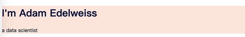
In HTML, we may want to combine more than one element together and what we are going to use is called an empty box. The empty box is a tag named div. For example, if we have
<h1>I'm Adam Edelweiss</h1>
<p>a data scientist</p>
Then we can put them together in a div box (also assign a classname to this box so that we can select it easily in the CSS),
<div class="cover">
<h1>I'm Adam Edelweiss</h1>
<p>a data scientist</p>
</div>
Then in CSS file, we change the content to,
h1 {
  color: #0a043c;
}.cover {
background-color: #ffe3d8;
}
It appears that we have a margin for our page and we want to eliminate this margin. We can modify this margin by changing the content of the CSS file to following,
body {
margin: 0;
}h1 {
margin-top:0;
color: #0a043c;
}.cover {
background-color: #ffe3d8;
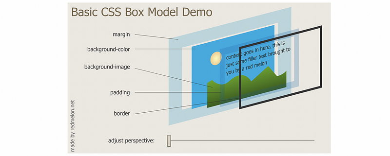
}(3) The Box Model
The main topic of CSS is the box model. To explain this, let’s now create an empty box in our page,
<center><div class="test"></div></center>
Then we can change the format of it by its classname,
.test {
background-color: blue;
height: 200px;
width: 200px;
}
If we change height of it, then,
.test {
background-color: blue;
height: 400px;
width: 200px;
}
We can also do the same thing to the width,
.test {
background-color: blue;
height: 400px;
width: 400px;
}
We can also use a percentage to assign the value,
.test {
background-color: blue;
height: 400px;
width: 100%;
}
We can also specify a border to our box,
.test {
background-color: blue;
height: 200px;
width: 200px;
border: solid;
}
The width of the border can be changed to 50 pixels (or any other values) around,
.test {
background-color: blue;
height: 200px;
width: 200px;
border: solid;
border-width: 50px;
}
We can also overwrite this border. Say if we want to remove the top border,
.test {
background-color: blue;
height: 200px;
width: 200px;
border: solid;
border-width: 50px;
border-top: 0;
}
We can also specify each of the borders by given 4 separated values (clock-wise) to the border-width property,
.test {
background-color: blue;
height: 200px;
width: 200px;
border: solid;
border-width: 0 20px 40px 60px;
}
We can actually put some content inside the empty box. For example,
<center><div class="test">Hello, World, Hello, World, Hello, World, Hello, World, Hello, World, Hello, World, Hello, World, Hello, World, Hello, World, Hello, World, Hello, World, Hello, World, Hello, World, Hello, World, Hello, World, Hello, World, Hello, World, Hello, World,</div></center>
Also, change the CSS formation to,
.test {
background-color: blue;
height: 200px;
width: 200px;
border: solid;
border-width: 20px;
}
Let’s say we don’t like the way it looks and we want to add a little bit padding or a little bit of space between the border and the content. In this case, we can assign 20px to the padding property,
.test {
background-color: blue;
height: 200px;
width: 200px;
border: solid;
border-width: 20px;
padding:20px;
}
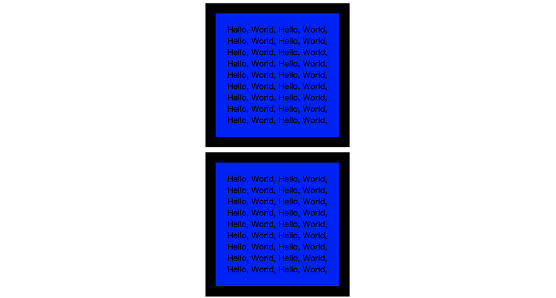
Let’s say if we have two same boxes like that,
<center>
<div class="test">Hello, World, Hello, World, Hello, World, Hello, World,
Hello, World, Hello, World, Hello, World, Hello, World,
Hello, World, Hello, World, Hello, World, Hello, World,
Hello, World, Hello, World, Hello, World, Hello, World,
Hello, World, Hello, World,</div>
<div class="test">Hello, World, Hello, World, Hello, World, Hello, World,
Hello, World, Hello, World, Hello, World, Hello, World,
Hello, World, Hello, World, Hello, World, Hello, World,
Hello, World, Hello, World, Hello, World, Hello, World,
Hello, World, Hello, World,</div>
</center>
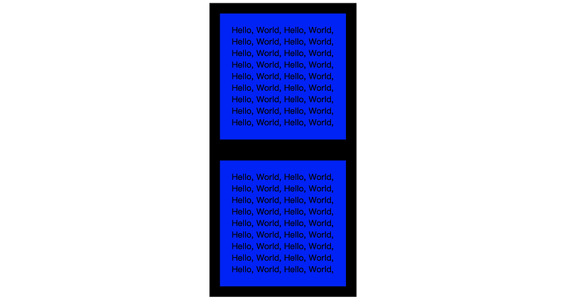
Then we may want to change the space between them so that the boarders of them won’t connect with each other. We can set the margin of these two boxes to 10px,
.test {
background-color: blue;
height: 200px;
width: 200px;
border: solid;
border-width: 20px;
padding:20px;
margin:10px;
}
We can find this box model from our browser. As we can see here,

We can have a more detailed diagram of the box model from markusvogl,
(4) CSS Display Property
You may discover that some of the element takes up the whole line while some. For example, on the following page,
<!DOCTYPE html>
<html lang="en" dir="ltr">
<head>
<meta charset="utf-8">
<title>My New Site</title>
<link rel="icon" href="favicon.png">
<link rel="stylesheet" href="css/style.css">
</head>
<body>
<div class="cover">
<img src="image/cloud.png" alt="could-img">
<h1>I'm Adam Edelweiss</h1>
<p>a data scientist</p>
<img src="image/cloud.png" alt="could-img">
<img src="image/mountain.png" alt="mountain-img">
</div>
</body>
</html>
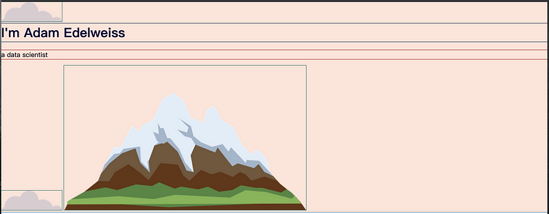
The block element means an element that takes a whole line as its box. The most common block elements are <p>, <h1> to <h6>, <div>, <ol>, <ul>, <li>, and <form>. The inline element means an element that only takes the size of it as its box. The most common block elements are <span>, <img>, and <a>.
For example, if we want to add the underline to the word “data” in “a data scientist”, we can use the <span> tag to avoid splitting the line,
<p>a <span style="text-decoration: underline;">data</span> scientist</p>
The width of a block element can be changed, but the width of an inline element is fixed. Suppose we want to have an inline element which we would like to change its width, we can change its display property to inline-block. There’s also a none value for the display property, which simply means to remove the element from the page.
Note that the difference between display:none; and visibility:hidden; is that the former one will remove the whole element and it will then take no place on the page. However, the latter one will remove the content of the element but leave an empty box on the page (just can not see).
(5) CSS Positioning
There are two rules for the CSS positioning,
- The order comes from the code
- Children sit on parents
We can also set a CSS property called position, which is the position of each element on the screen and the change of the default layout. The position property has four properties, static, relative, absolute, and fixed.
- Static (default): All the HTML are static by default and it means to go along the HTML rules and keep to the default HTML flow.
- Relative: it allows us to change the relative position from the static form.
There is also coordinate properties named top, bottom, left, and right. We can also set the value of these properties to move the elements in our page. For example,
img {
  position: relative;
  left:30px;
}
Then the image will be moved to the right of the static position by 30 pixels. Note that change the relative position of an element will not change the position of the other elements (allow other elements to keep their own positions).
- Absolute: it allows to change the position by its parent element.
Note that using the absolute positioning does affect the flow of your HTML, this means the position of the other elements will be changed
- Fixed: it means to fix the element in its position when we scroll down the page. This is always been used for a navigation bar.
(6) CSS Alignment
The most common alignment from a page is centering. For example, we can change all the elements in the body to be centered by the text-align property,
body {
  text-align: center;
}
However, this will not work when we change the width of an element. After changing the width of an element, we have to assign auto to the margin property in order to make it centered,
h1 {
  width:600px;
  margin:auto;
}
(7) CSS Font Style
To set the font style of our page, the easiest way is to change the value of the font-family property (i.e. sans-serif, which is the default value for this property),
body {
  font-family: sans-serif;
}
Or we can also change its value to serif, monospace, or fantasy.
Also, there are some other font styles that we would like to use, for example, Comic Sans MS. Because they are not inbuilt font styles, we are not sure whether a browser that is viewing our webpage can render these font styles in the correct way or not. So we have to give an optional font style. For example,
body {
  font-family: "Comic Sans MS", sans-serif;
}
Then the browser will first find out whether we have the style Comic Sans MS. If there’s not a style like that, it will render the style with sans-serif. There is actually a list of safe font styles that we can use for our page because we can trust that most of the operating systems have that font style. Someone also made a website that shows us what is the failure probability for each of the font styles.
Another way to make sure that every browser can render my font style is by embedding the font style in the HTML. We can easily make it by going to Google Fonts and select the fonts that we would like to use in our browser.
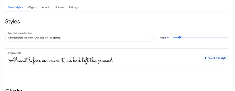
For example, if we are going to use the style “Sacramento”, then we can find the style and click on “Select this style”,
Then we can go to the navigation bar and click on the “View your selected families” sign,
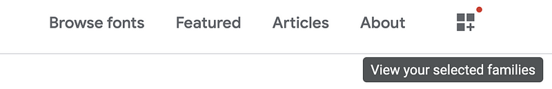
From where we can find the embedded HTML link to be added in our browser,
<link rel="preconnect" href="https://fonts.gstatic.com">
<link href="https://fonts.googleapis.com/css2?family=Sacramento&display=swap" rel="stylesheet">
and the CSS rules to specify this font style,
font-family: 'Sacramento', cursive;
(8) CSS Size
- Font Size
If we want to make the font size changed with the zoomed-in page or zoomed-out page, then we have to use a percentage to represent a font size. In CSS, 100% basically means 16px for us,
h1 {
   font-size: 562.5%;
}
Or we can also use the unit em for us and 1em = 16px, then,
h1 {
   font-size: 5.625em;
}
But there can be a problem if we have a font size in the parent’s CSS. For example, if we apply 2 em to the <body> tag, then all the h1 tags will then have a font size of 2 times 5.625 > 10 em, which can be super bad. For CSS3, there’s a new unit called rem which will ignore the parent’s settings for us and this is quite convenient to use.
(9) CSS Image Floating and Clearing
Sometimes we want the text to be displayed around the image, what should we do? This is called a CSS image floating. To change an image to float, we can set the property float to value “left” (or “right”) by,
float:left;
We would also be likely to have an image that is going to have some space with the text around it. This can be done by adding more margins around the image,
margin: 30px;
This is also a situation that we don’t want a specific paragraph to be float around an image but the image must be set to float because some other paragraphs have to be float around it. Then we have to use the clear property for that specific paragraph. For example, to avoid a left floating image,
.spec-para {
    clear: left;
}
Similarly, to avoid a right floating image,
.spec-para {
    clear: right;
}